Colour, it's with us in our daily lives and it effects us in so many ways.
Once we know the rules however, we can use these too and recognise when others are using it to influence us.
Have you ever wondered why acid or very bright colours are making a comeback in workplaces and some very specific public places?
Or perhaps your doctor's surgery or yoga centre have rediscovered pastels?
The theory goes that the more shocking the colour the more invigorated the brain becomes. So, if you have a hotdesk area at work that's just been refurbished to a not so relaxing lime green, this is because the powers that be want you to be alert and you need to concentrate. The workstations themselves may be a toned down muted version so you are not overly stimulated, but you get the idea.
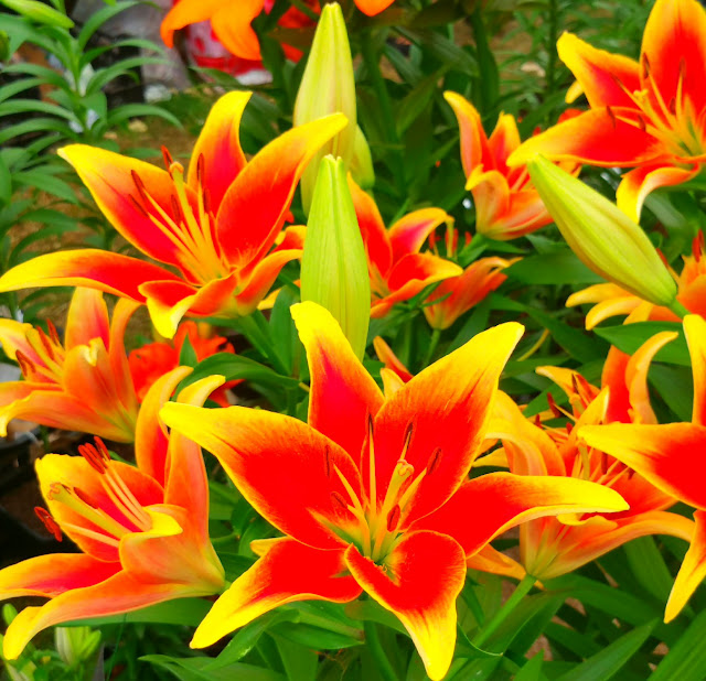
Colour in nature reflects many a mood, blue and white flowers are deeply calming. Whereas summer invites vibrant hues and forms. Vibrant being active word here and when people refer to these months as the hothouse months, and describe themselves as being energised, we now know the reason why.
So next time you are thinking of painting your study, bedroom or living space, think of the mood you want to create.
Perhaps you have a choice of two libraries to study at, they both have the same resources but one has a new "funky" colour scheme and the other is still keeping their traditional cream and wood paneling... which environment would you be able to concentrate in?
Finally, if you do need to calm yourself, take the example of many yoga and meditation centres around the globe and find a room with muted colours.


No comments:
Post a Comment